C# WPF Button Control

The WPF Button control is found in the System.Windows.Controls namespace within the PresentationFramework.dll. In this blog post I am referring to the Button control that is available in C# WPF Application .NET 6.0 with Visual Studio 2022 (although this code example might still work OK with older .NET versions).
Page Content:
The WPF Button object represents a Windows button control, which reacts to one of the Buttons events whenever a user interacts with the Button. For example, the Click event is triggered whenever a user clicks on the Button with their input device (i.e. mouse, touch screen, keypad, pointer, controller, etc).
Example 1 : Standard Button
In the following example, I add a Button control to the window by entering in the XAML code for the Button into the MainWindow.xaml file, as shown below.
I then edit some of the Button's properties, such as Size, Content, Tooltip, and Click event, in the XAML code as follows:
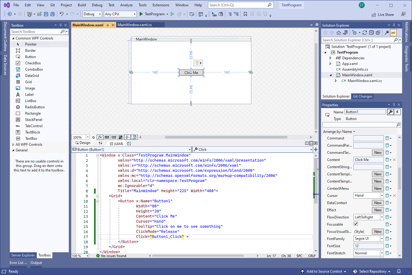
<Window x :Class ="TestProgram.MainWindow"
xmlns ="http://schemas.microsoft.com/winfx/2006/xaml/presentation"
xmlns :x ="http://schemas.microsoft.com/winfx/2006/xaml"
xmlns :d ="http://schemas.microsoft.com/expression/blend/2008"
xmlns :mc ="http://schemas.openxmlformats.org/markup-compatibility/2006"
xmlns :local ="clr-namespace:TestProgram"
mc :Ignorable ="d"
Title ="MainWindow" Height ="225" Width ="400">
<Grid >
<Button x :Name ="Button1"
Width ="80"
Height ="20"
Content ="Click Me"
Cursor ="Hand"
ToolTip ="Click on me to see something"
ClickMode ="Release"
Click ="Button1_Click" >
</Button >
</Grid >
</Window > In the MainWindow.XAML.CS file, I then edit the Button's click event function (that was created and added when I edited the XAML file above), to demonstrate that something happens once I click on the Button when I execute the program:
using System;
using System.Collections.Generic;
using System.Linq;
using System.Text;
using System.Threading.Tasks;
using System.Windows;
using System.Windows.Controls;
using System.Windows.Data;
using System.Windows.Documents;
using System.Windows.Input;
using System.Windows.Media;
using System.Windows.Media.Imaging;
using System.Windows.Navigation;
using System.Windows.Shapes;
namespace TestProgram
{
/// <summary>
/// Interaction logic for MainWindow.xaml
/// </summary>
public partial class MainWindow : Window
{
public MainWindow ()
{
InitializeComponent ();
}
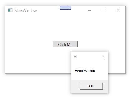
private void Button1_Click (object sender, RoutedEventArgs e)
{
// The user clicked the button so do some action
MessageBox .Show ("Hello World!" , "Hi" );
}
}
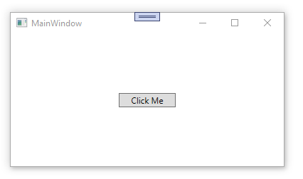
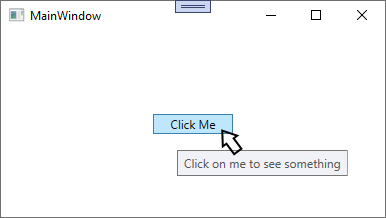
}When I run the above example and then click on the Button control displayed in the center of the programs window then I then see something similar to the following:
The above example may seem rather boring, however it is only meant to show you the very basics of how to add and use a WPF Button control.
Example 2 : Styled Button
To spruce the button up and make it appear a little more lively, I can take advantage of WPF's extensive Styling techniques.
In the following example, I edit the App.xaml file and add a Style to the Application.Resources element. Adding the Style in this manner will allow this Style to be available for use anywhere within this application.
I specify that this Style target's Button controls specifically, however I also set the x:Key="btnDownload" attribute in the Style so that this particular Style will only affect Button's that have a key value of btnDownload.
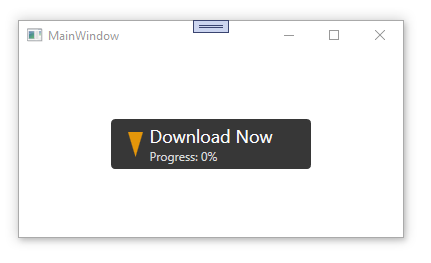
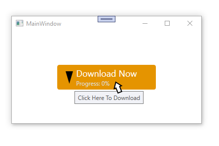
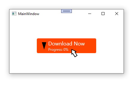
This Button Style is being used here to set the Button's color, font, and custom graphics, as well as the color of the Button whenever the mouse pointer is hovered over the Button and when the Button is being clicked on:
<Application x :Class ="TestProgram.App"
xmlns ="http://schemas.microsoft.com/winfx/2006/xaml/presentation"
xmlns :x ="http://schemas.microsoft.com/winfx/2006/xaml"
xmlns :local ="clr-namespace:TestProgram"
StartupUri ="MainWindow.xaml">
<Application.Resources >
<Style TargetType ="{x :Type Button }" x :Key ="btnDownload">
<Setter Property ="Background" Value ="#373737" />
<Setter Property ="Foreground" Value ="White" />
<Setter Property ="FontSize" Value ="15" />
<Setter Property ="SnapsToDevicePixels" Value ="True" />
<Setter Property ="Template">
<Setter.Value >
<ControlTemplate TargetType ="{x :Type Button }">
<Border CornerRadius ="4" Background ="{TemplateBinding Background }">
<Grid >
<Path x :Name ="PathIcon" Width ="15" Height ="25" Stretch ="Fill" Fill ="#FFE4960A" HorizontalAlignment ="Left" Margin ="17,0,0,0" Data ="F1 M -100,0L 100,0L 0,150L 0,150L 0,150 Z "/>
<ContentPresenter x :Name ="MyContentPresenter" Content ="{TemplateBinding Content }" HorizontalAlignment ="Center" VerticalAlignment ="Center" Margin ="0,0,0,0" />
</Grid >
</Border >
<ControlTemplate.Triggers >
<Trigger Property ="IsMouseOver" Value ="True">
<Setter Property ="Background" Value ="#E59400" />
<Setter Property ="Foreground" Value ="White" />
<Setter TargetName ="PathIcon" Property ="Fill" Value ="Black" />
</Trigger >
<Trigger Property ="IsPressed" Value ="True">
<Setter Property ="Background" Value ="OrangeRed" />
<Setter Property ="Foreground" Value ="White" />
</Trigger >
</ControlTemplate.Triggers >
</ControlTemplate >
</Setter.Value >
</Setter >
</Style >
</Application.Resources >
</Application >
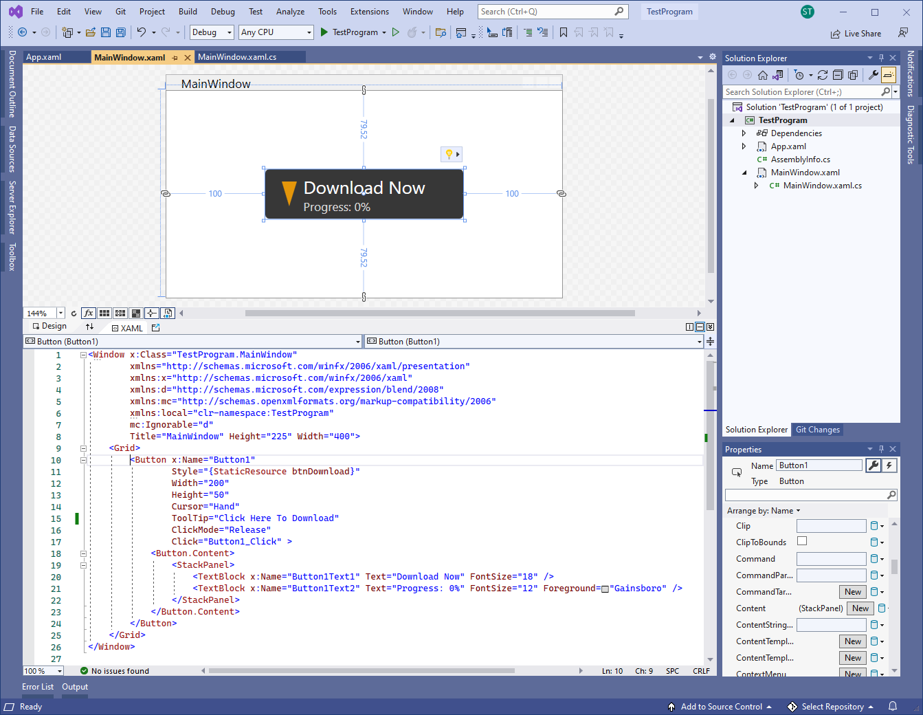
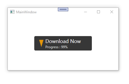
In the MainWindow.xaml file I add a Button control to the window in the XAML file, and then set the Button's property values for Style, Width, Height, Cursor, and ToolTip, as well as added a Click event to it.
In the Button's content section, I add a StackPanel and add two TextBlock's into it for displaying specific different formated text values on the face of the Button.
<Window x :Class ="TestProgram.MainWindow"
xmlns ="http://schemas.microsoft.com/winfx/2006/xaml/presentation"
xmlns :x ="http://schemas.microsoft.com/winfx/2006/xaml"
xmlns :d ="http://schemas.microsoft.com/expression/blend/2008"
xmlns :mc ="http://schemas.openxmlformats.org/markup-compatibility/2006"
xmlns :local ="clr-namespace:TestProgram"
mc :Ignorable ="d"
Title ="MainWindow" Height ="225" Width ="400">
<Grid >
<Button x :Name ="Button1"
Style ="{StaticResource btnDownload }"
Width ="200"
Height ="50"
Cursor ="Hand"
ToolTip ="Click Here To Download"
ClickMode ="Release"
Click ="Button1_Click" >
<Button.Content >
<StackPanel >
<TextBlock x :Name ="Button1Text1" Text ="Download Now" FontSize ="18" />
<TextBlock x :Name ="Button1Text2" Text ="Progress: 0%" FontSize ="12" Foreground ="Gainsboro" />
</StackPanel >
</Button.Content >
</Button >
</Grid >
</Window > In the MainWindow.XAML.CS file, I edit the Button's click event function (that was created and added when I edited the XAML file above), to demonstrate that something happens once I click on the Button when I execute the program:
using System;
using System.Collections.Generic;
using System.Linq;
using System.Text;
using System.Threading.Tasks;
using System.Windows;
using System.Windows.Controls;
using System.Windows.Data;
using System.Windows.Documents;
using System.Windows.Input;
using System.Windows.Media;
using System.Windows.Media.Imaging;
using System.Windows.Navigation;
using System.Windows.Shapes;
namespace TestProgram
{
/// <summary>
/// Interaction logic for MainWindow.xaml
/// </summary>
public partial class MainWindow : Window
{
public MainWindow ()
{
InitializeComponent ();
}
private void Button1_Click (object sender, RoutedEventArgs e)
{
// simulate downloading something
for(int n=0; n<100; n++)
{
// update progress display to show download progress
Button1Text2.Text = "Progress : " + n.ToString() + "%" ;
}
}
}
}When I run the above example and then click on the Button control displayed in the center of the programs window then I see something similar to the following:
Final Thoughts
Thank you for reading, I hope you found this blog post (tutorial) educational and helpful.