C# WPF Grid Splitter Control
The Grid Splitter control class is found in the System.Windows.Controls namespace within the PresentationFramework.dll assembly. In this blog post I am referring to the Grid Splitter control that is available in C# WPF Application .NET 6.0 with Visual Studio 2022 (although this code example might still work OK with older .NET versions).
Page Contents:
About GridSplitter
The GridSplitter provides the user with a means to easily resize and redistribute the space between columns or rows of a Grid control at run time. When a GridSplitter is used to resize two rows, for example, the ActualHeight property of one row is increased while at the same time the ActualHeight property of the other row is decreased by the same amount, which results in the overall Grid dimensions to remain the same. When the GridSplitter is used to resize two columns, the same is true except it changes the columns ActualWidth property.
The GridSplitter can be used to overlap a Grid's row or column that contains other content, or it can occupy a row or column by itself. One reason why you might want to put the GridSplitter control into its own Grid row or column, is because there may be times when the GridSplitter may be obscured or hidden by other objects that are contained in the Children collection of the Grid, so having it occupy its own row or column might (might) help prevent that from happening.
To determine if a GridSplitter should move horizontally or vertically, you can either set the GridSplitter's HorizontalAlignment or VerticalAlignment properties, or you can change the ResizeDirection and ResizeBehavior property values.
Multiple GridSplitter's can be used at the same time, both horizontally (between columns) and vertically (between rows).
New C# WPF Project
To begin, I performed the following steps to create a new blank C# WPF project:
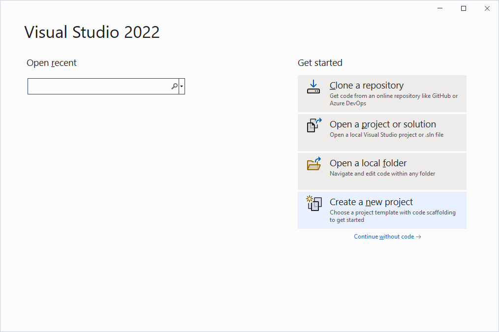
- I open up Visual Studio 2022, and select Create a new project in the opening screen:
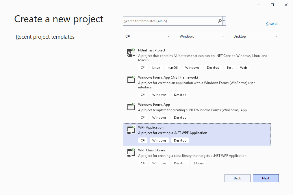
- In the Create a new project screen, I set the template filters to C# > Windows > Desktop, and then select the WPF Application project template before clicking on the Next button:
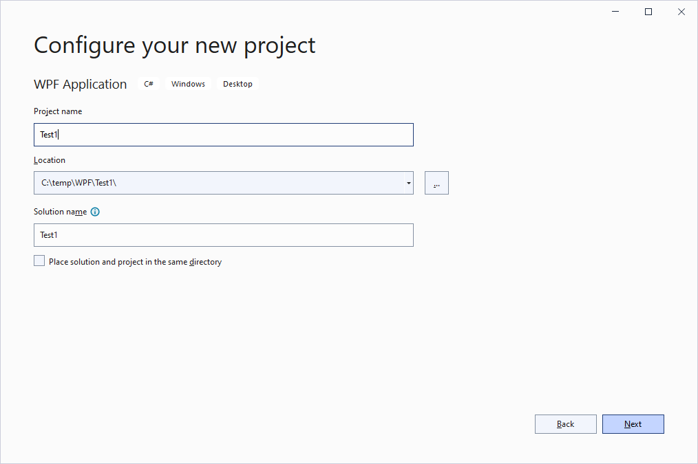
- In the Configure your new project screen, I set the Project name, Location, and Solution name, before clicking on the Next button:
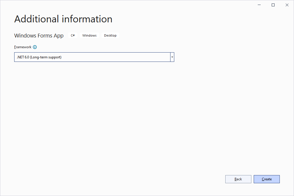
- In the Additional information screen, I select .NET 6.0 (Long-term support) option from the Framework drop down, and then click on the Create button:
- AFter clicking on the Create button, the following new blank C# WPF project then opens and displays in the Visual Studio 2022 editor:
Example XAML Code
To add the Grid Splitter control to your user interface, you can double click on its name (i.e. Grid Splitter) as listed in the Toolbox window panel within the XAML editor window, which will insert its code into the XAML file at the cursor location. Alternatively, you can single click on it and then drag and drop it onto your user interface. Once it is properly added to the user interface's XAML file then it will appear on the user interface surface area having default control values.
After you have added the Grid Splitter control to your form, then once you select it then you can view and edit that objects property values in the Properties window within the Forms editor window, where you can then change the controls Name, Text, and other properties as you desire. Alternatively, you an edit its XAML script and set its property values there, and/or you can also access its properties from C# source code once you have set the controls x:Name="" property value.
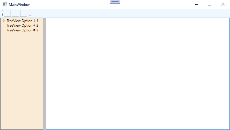
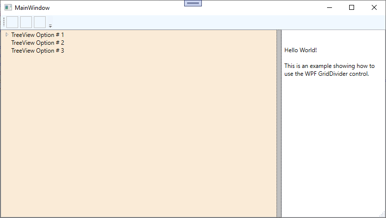
In the following example, in the MainWindow.xaml file I edited the Grid and added two row definitions to it. I then assigned a ToolBar to the top row, and another Grid to the bottom row. For demo purposes, I added a few Button's to the ToolBar. In the second Grid, I defined two columns, and added a TreeView to the left column, and a RichTextBox to the right column. I then added a GridSplitter control to that grid and assigned it to the left column, but with a HorizontalAlignment value of Right so that it will stick to the right hand side of the left column. For this demo example, I set the GridSplitter control (along with the other controls) Background color property so that they each have unique colors to better identify them by. I also widened the GridSplitter by setting its Width property value to 10 so that it is easier to grab onto.
<Window x :Class ="TestProgram.MainWindow"
xmlns ="http://schemas.microsoft.com/winfx/2006/xaml/presentation"
xmlns :x ="http://schemas.microsoft.com/winfx/2006/xaml"
xmlns :d ="http://schemas.microsoft.com/expression/blend/2008"
xmlns :mc ="http://schemas.openxmlformats.org/markup-compatibility/2006"
xmlns :local ="clr-namespace:TestProgram"
mc :Ignorable ="d"
Title ="MainWindow" Height ="225" Width ="400">
<Grid >
<Grid .RowDefinitions >
<RowDefinition Height ="auto" MinHeight ="25"/>
<RowDefinition Height ="*" MinHeight ="25"/>
</Grid .RowDefinitions >
<ToolBarTray Grid .Row ="0" Background ="AliceBlue">
<ToolBar Band ="1" BandIndex ="1" Background ="AliceBlue">
<Button Width ="24" Height ="24" x:Name ="buttonNew" ToolTip ="New" Cursor ="Hand" BorderBrush ="Silver" BorderThickness ="1" Margin ="2,0,2,0"></Button >
<Button Width ="24" Height ="24" x:Name ="buttonOpen" ToolTip ="Open" Cursor ="Hand" BorderBrush ="Silver" BorderThickness ="1" Margin ="2,0,2,0"></Button >
<Button Width ="24" Height ="24" x:Name ="buttonSave" ToolTip ="Save" Cursor ="Hand" BorderBrush ="Silver" BorderThickness ="1" Margin ="2,0,2,0"></Button >
</ToolBar >
</ToolBarTray >
<Grid Grid .Row ="1">
<Grid .ColumnDefinitions >
<ColumnDefinition Width ="150" MinWidth ="50"/>
<ColumnDefinition Width ="*" MinWidth ="50"/>
</Grid .ColumnDefinitions >
<TreeView Grid .Column ="0" Background ="AntiqueWhite" x:Name ="treeView1">
<TreeViewItem x:Name ="treeViewOption1" Header ="TreeView Option # 1">
<TreeViewItem x:Name ="treeViewOption1a" Header ="Option # 1 SubOption a"></TreeViewItem >
</TreeViewItem >
<TreeViewItem x:Name ="treeViewOption2" Header ="TreeView Option # 2"></TreeViewItem >
<TreeViewItem x:Name ="treeViewOption3" Header ="TreeView Option # 3"></TreeViewItem >
</TreeView >
<GridSplitter Grid .Column ="0" Width ="10" HorizontalAlignment ="Right" VerticalAlignment ="Stretch" Background ="Silver"/>
<RichTextBox Grid .Column ="1" x:Name ="richTextBox1"></RichTextBox >
</Grid >
</Grid >
</Window > Example Preview
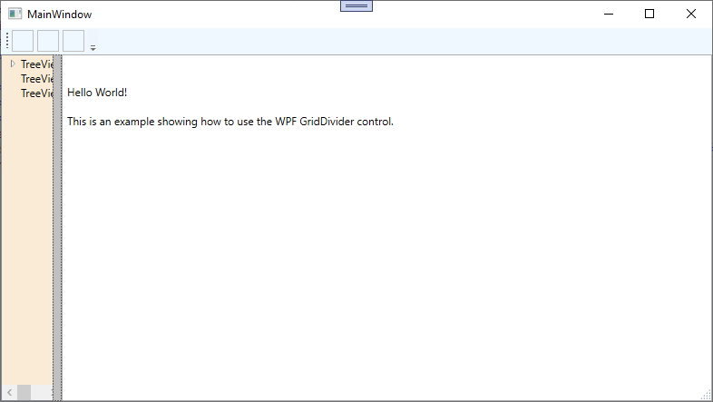
When you run the above example and drag the vertical gray bar with your mouse pointer, then you should see something similar to the following:
Final Thoughts
I prefer to use the GridSplitter in a lot of my programs (as oppose to not using it) because it gives the UI a much more professional look and feel experience for the user, by allowing the user to have more control over the appearance of the UI. The users desired positioning of the GridSplitter can also be recorded into a users preference or settings file, which can then be loaded and automatically reapplied to the Grid's columns and rows ActualSize properties the next time the user runs the program.
Thank you for reading, I hope you found this blog post (tutorial) educational and helpful.