C# WinForms DateTimePicker Control
The DateTimePicker control is found in the System.Windows.Forms namespace within the System.Windows.Forms.dll. In this blog post I am referring to the DateTimePicker control that is available in C# .NET-Core (.NET 6.0) with Visual Studio 2022 (although this code example might still work OK with older .NET versions).
The purpose and function of the DateTimePicker control is to provide an easy to use interface that allows a user to select a date and time, as well as to display a date and time to the user while having a specified format.
The DateTimePicker control makes it easy to work with dates and times because it handles a lot of the data validation automatically. It should be noted that the DateTimePicker control only supports Gregorian style calendar systems.
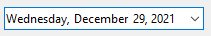
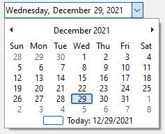
The DateTimePicker control visually appears on a form as a drop down list with a date and time data represented in text, as well as a simplified calendar that appears when the user clicks the down-arrow next to the list.
To use an up-down spin button control to adjust the date/time value, set the ShowUpDown property to true, however the calendar will not drop down when the control is selected while the ShowUpDown property value is true.
If you want the DateTimePicker control to appear as a control for picking or editing Times instead of Dates, then set the ShowUpDown property to True AND set the Format property to Time.
If the Format property is set to Custom then you can create your own format style by setting the CustomFormat property and building a custom format string. There are many custom variations that can be created, for example "hh:mm:ss dddd MMMM dd, yyyy" will display something similar to "06:14:37 Saturday December 25, 2021"
Example Source Code
This example uses a DateTimePicker control, along with a Label control.
To add the DateTimePicker control to your form, you can double click on its name (i.e. DateTimePicker) as listed in the Toolbox window panel within the Form editor window. Alternatively, you can single click on it and then drag and drop it onto your form, to position it more closer to where you want it to be positioned at. Once it is added to the form then it will appear on the forms surface area having default control values.
After you have added the DateTimePicker control to your form, then once you select it then you can view and edit that objects property values in the Properties window within the Forms editor window, where you can then change the controls Name, Text, and other properties as you desire.
In the following example, I added a DateTimePicker control to the Form, and then once it was added to the Form I then double clicked on it which automatically generated and linked a callback method to the controls ValueChanged event. I then added a Label control to the form and positioned it to be below the DateTimePicker control object, and then renamed the Label control to "feedbackLabel" by selecting it and adjusting its Name property within the Property Window:
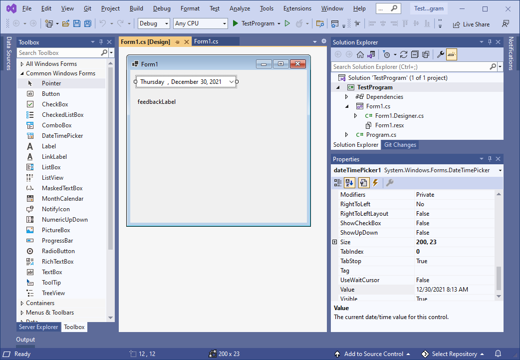
In the Forms source code, I then added some code into the ValueChanged callback method to handle when the user selects a new date from the DateTimePicker control object:
namespace TestProgram
{
public partial class Form1 : Form
{
public Form1 ()
{
InitializeComponent ();
}
private void Form1_Load (object sender, EventArgs e)
{
// init
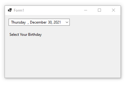
feedbackLabel.Text = "Select Your Birthday" ;
}
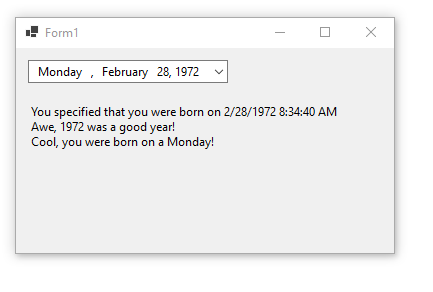
private void dateTimePicker1_ValueChanged (object sender, EventArgs e)
{
// get the new date value and respond
feedbackLabel.Text = "You specified that you were born on " + dateTimePicker1.Value.ToString ();
feedbackLabel.Text += Environment .NewLine;
feedbackLabel.Text += "Awe, " + dateTimePicker1.Value.Year.ToString () + " was a good year!" ;
feedbackLabel.Text += Environment .NewLine;
feedbackLabel.Text += "Cool, you were born on a " + dateTimePicker1.Value.DayOfWeek.ToString () + "!" ;
}
}
}When you run the above examples and select a date value using the DateTimePicker control then you should see something similar to the following:
Final Thoughts
Thank you for reading, I hope you found this blog post (tutorial) educational and helpful.