C# WinForms MaskedTextBox
The MaskedTextBox control is found in the System.Windows.Forms namespace within the System.Windows.Forms.dll. In this blog post I am referring to the MaskedTextBox control that is available in C# .NET-Core (.NET 6.0) with Visual Studio 2022 (although this code example might still work OK with older .NET versions).
The MaskedTextBox control in an enhanced TextBox control, which offers you a Mask property that can be used to automatically validate user input.
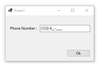
At run time, whenever a MaskedTextBox control is displayed on a Form that MaskedTextBox control object represents the mask specified in its Mask property as a series of prompt characters and optional literal characters. Each editable mask position, representing a required or optional input, is shown with a single prompt character. For example, the number sign (#) is often used as a placeholder for a numeric character input. You can use the PromptChar property to specify a custom prompt character that will be displayed to the user.
The HidePromptOnLeave property determines if the user sees the prompt characters when the control loses input focus, which is useful for presenting a cleaner form to the user and just highlighting attention to just the control that is currently in focus.
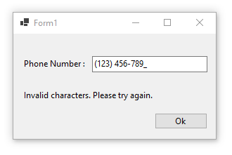
As the user types or enters input into the MaskedTextBox control object, valid input characters replace their respective prompt characters in a sequential fashion. If the user types an invalid input character, no replacement occurs, but instead a beep is issued if the BeepOnError property is set to true, and the MaskInputRejected event is raised. You can provide your own custom error logic by handing this MaskInputRejected event.
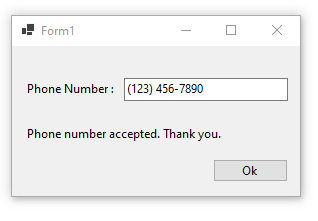
The MaskFull property value can be used to verify if the user has entered all of the required input values or not. The Text property will return the user's input formatted according to the mask and TextMaskFormat property.
You can set the AsciiOnly property in efforts to restrict the user input to the characters sets a-z, A-Z, and 0-9.
The TypeValidationCompleted event can be used to detect whether the user removes focus from the MaskedTextBox control object when it contains an invalid value. If type validation succeeds then the object representing the value will be available through the ReturnValue property of the TypeValidationEventArgs parameter.
Some of the common TextBox keyboard shortcuts do not work with the MaskedTextBox control. The CTRL-R (right justify text), CTRL-L (left justify text), and CTRL-L (center text) have no effect.
Example Source Code
This example uses a MaskedTextBox control, two Label controls, and a Button control.
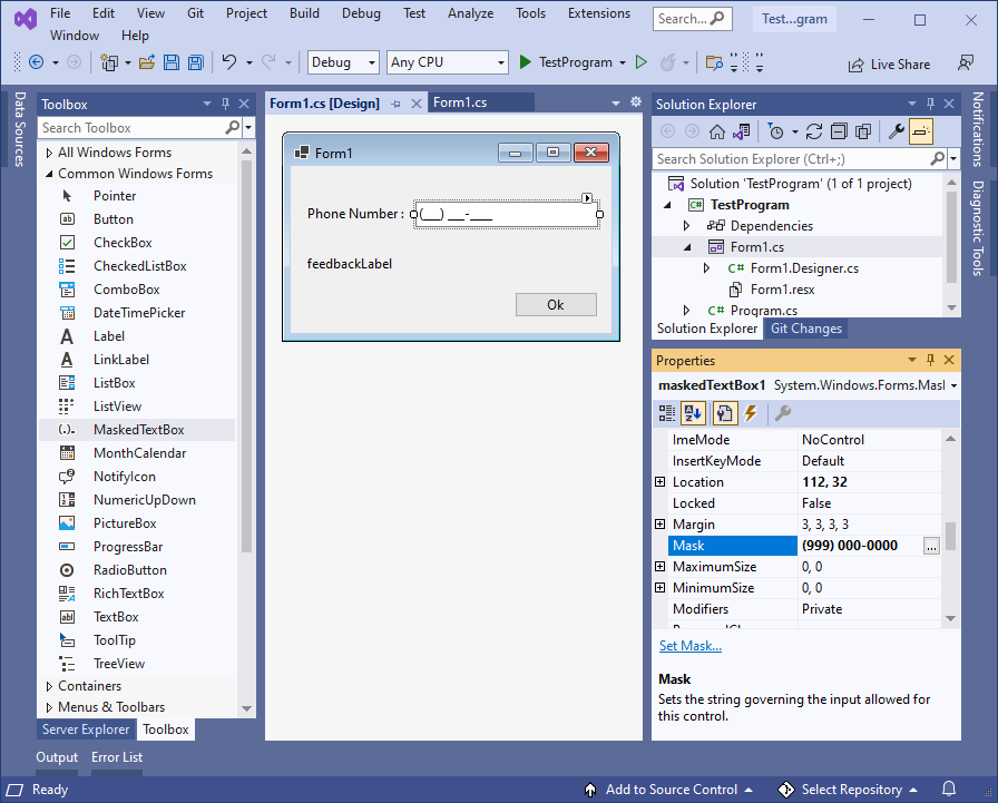
To add the MaskedTextBox control to your form, you can double click on its name (i.e. MaskedTextBox) as listed in the Toolbox window panel within the Form editor window. Alternatively, you can single click on it and then drag and drop it onto your form, to position it more closer to where you want it to be positioned at. Once it is added to the form then it will appear on the forms surface area having default control values.
After you have added the MaskedTextBox control to your form, then once you select it then you can view and edit that objects property values in the Properties window within the Forms editor window, where you can then change the controls Name, Mask, Text, and other properties as you desire.
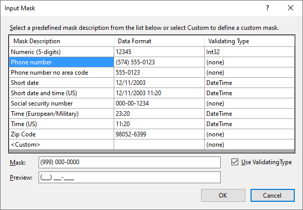
In the following example, I added a MaskedTextBox control to the Form, along with two Label controls and one Button control. After selecting the MaskedTextBox control object, I clicked on the three dots within the Mask property field which opened up the Input Mask editor dialog shown below. I then selected a pre-made mask template for Phone Number, and then clicked OK to close that dialog. While the MaskedTextBox control object was still selected, I viewed the Events within the Property window, and double clicked on the KeyDown event and again on the MaskInputRejected event, which automatically created and linked a callback method to those events into the Forms source code. I then selected the Label controls and set their Text property values as shown, and renamed Label2 to feebackLabel. In this example, the Button control object is only being used to allow focus to be taken off of the MaskedTextBox control object, but I went ahead and set its Text property to have a value of "OK" and I then double clicked on the Button control object to automatically create and link a callback method to its Click event (simply for future use):
In the Forms source code file, I clear the feedbackLabel text property in the MaskedTextBox's KeyDown event method. In the MaskedTextBox's MaskInputRejected event method I added code to check if the input is complete or invalid, and provide feedback accordingly by updating the feebackLabel's text property:
namespace TestProgram
{
public partial class Form1 : Form
{
public Form1 ()
{
InitializeComponent ();
}
private void Form1_Load (object sender, EventArgs e)
{
//
}
private void maskedTextBox1_KeyDown(object sender, KeyEventArgs e)
{
// clear any existing feedback message
feedbackLabel.Text = "" ;
}
private void maskedTextBox1_MaskInputRejected(object sender, MaskInputRejectedEventArgs e)
{
// check the input status and provide feedback accordingly
if (maskedTextBox1.MaskFull)
{
feedbackLabel.Text = "Phone number accepted. Thank you." ;
}
else if (e.Position == maskedTextBox1.Mask.Length)
{
feedbackLabel.Text = "You have reached the end of this data field." ;
}
else
{
feedbackLabel.Text = "Invalid characters. Please try again." ;
}
}
private void button1_Click(object sender, EventArgs e)
{
// TODO : do something
}
}
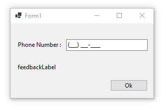
}When you run the above examples and click on the control then you should see something similar to the following:
Final Thoughts
Thank you for reading, I hope you found this blog post (tutorial) educational and helpful.